Project Overview – Twenty Seven
Branding
Twenty Seven
Studio Blue Agency
2024
Goals and objective
Twenty Seven is a brunch restaurant where warmth, care, and attention to detail shape every experience. When Twenty Seven approached us, they had a vision of creating a brand that felt welcoming, approachable, and distinctly personal – a space where guests feel both comforted and inspired. Our task was to translate that vision into a cohesive identity that set them apart from competitors while staying true to their values of connection, quality, and creativity.
The mission was clear: build a brand that invites guests to linger and savor the moment, whether they’re enjoying a perfectly crafted coffee, indulging in a signature dish, or simply soaking in the ambiance. Twenty Seven wanted their visual identity to feel thoughtful and human – an extension of the care they put into every plate and interaction.


Our solution
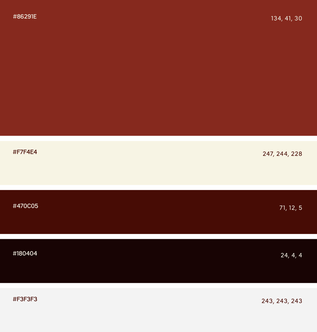
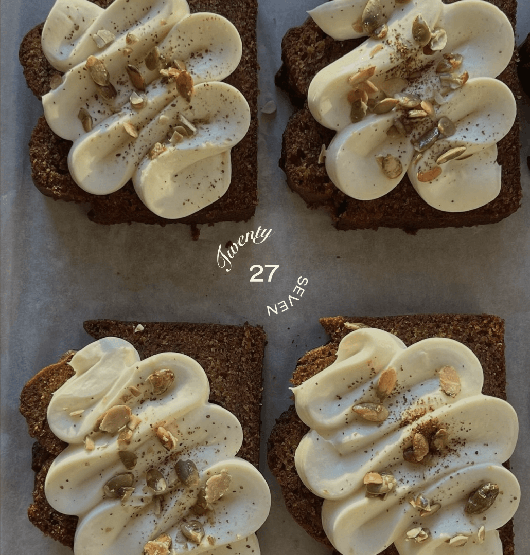
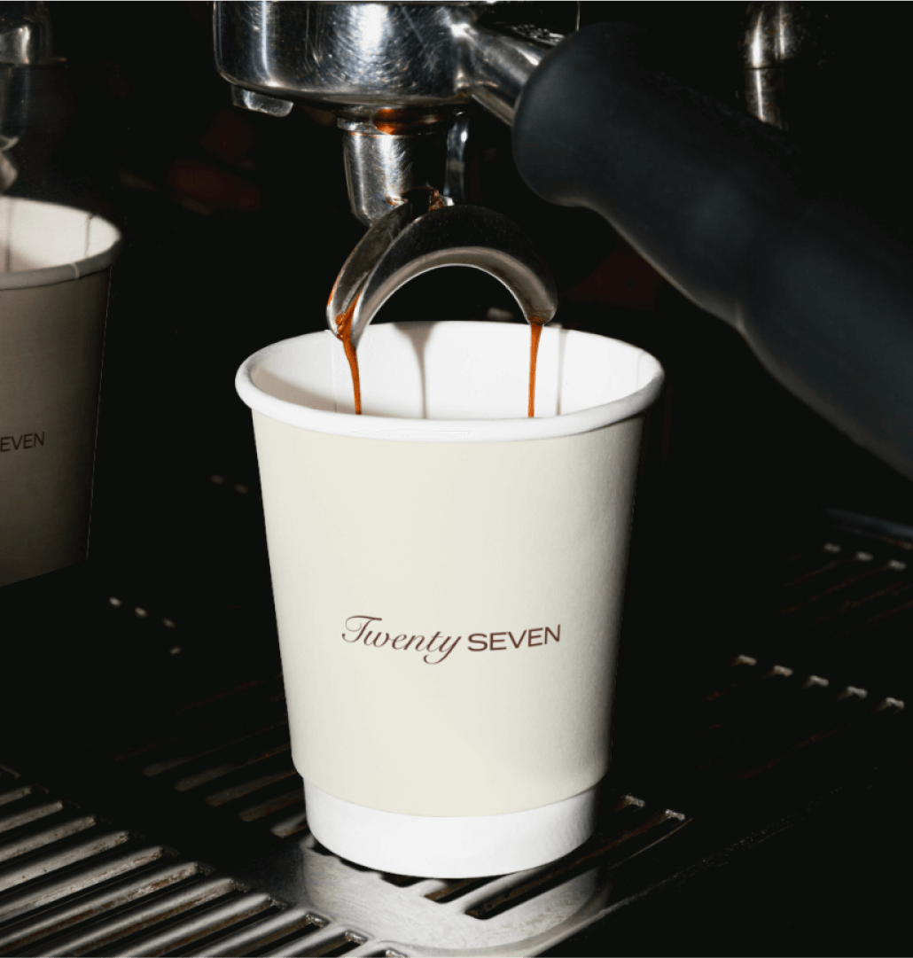
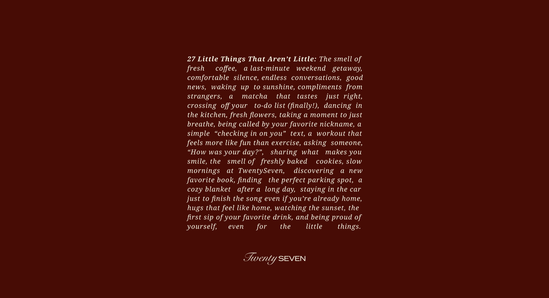
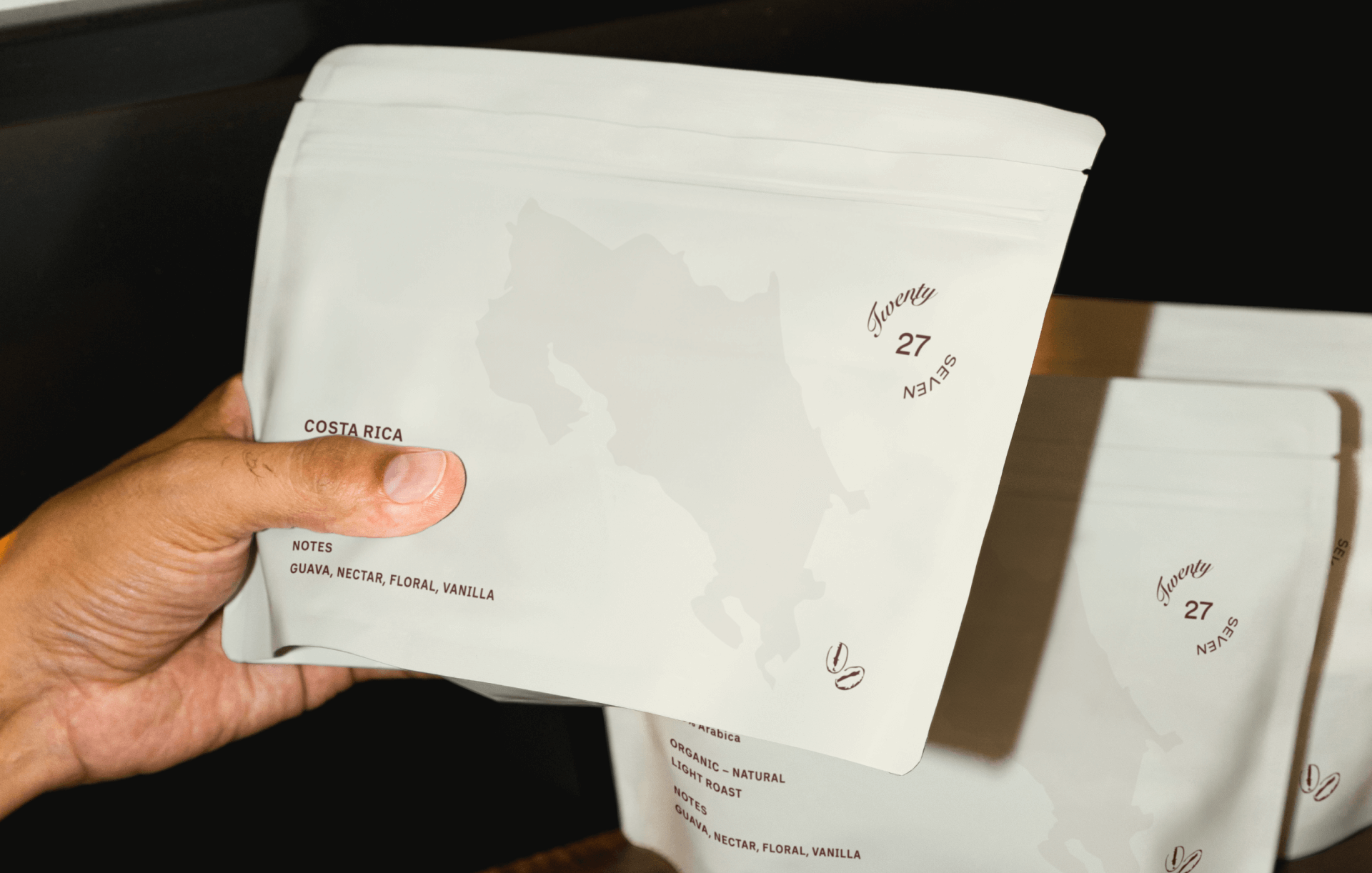
We began by crafting a color palette and visual direction that reflected warmth and authenticity. Eschewing the cooler tones often seen in the industry, we leaned into earthy reds and inviting greens – hues that evoke comfort and personality while helping the brand stand out from the crowd. These colors mirror the welcoming vibe of Twenty Seven, blending sophistication with a relaxed charm.
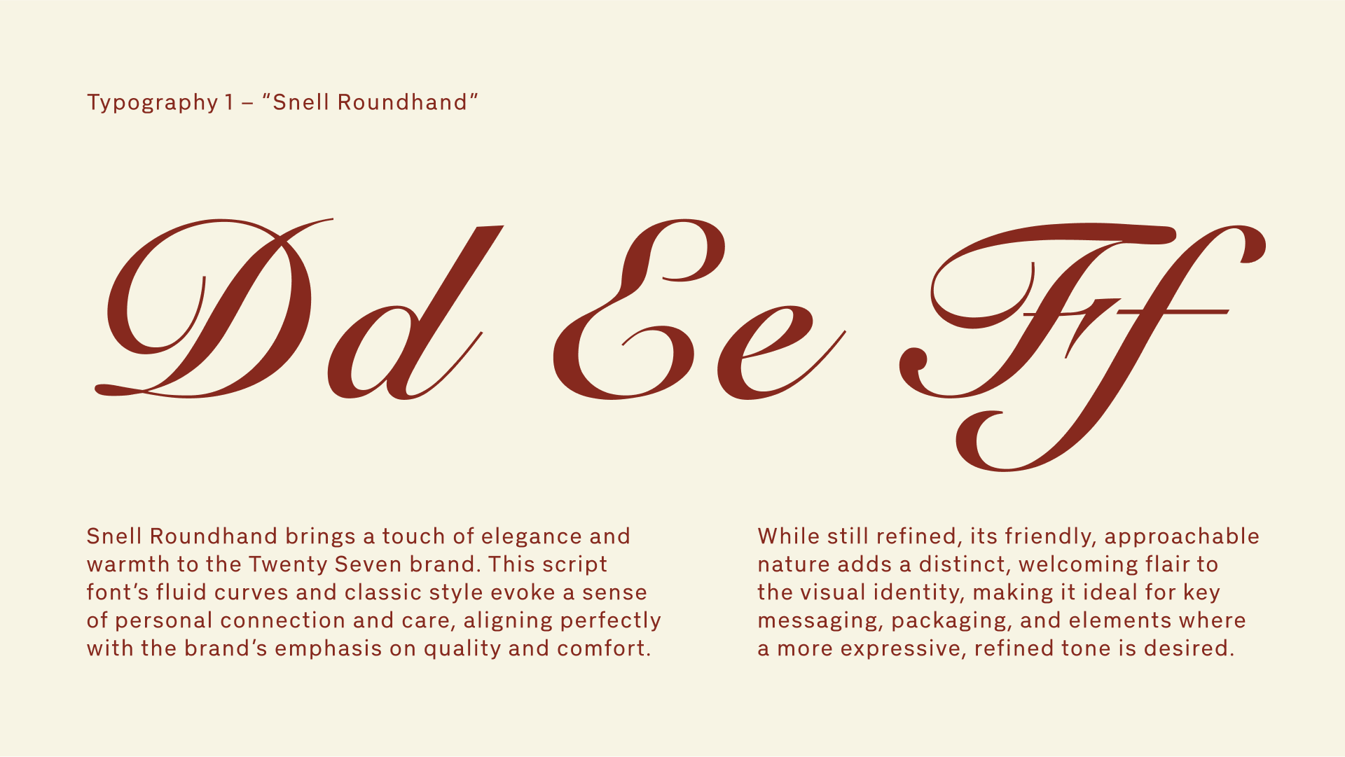
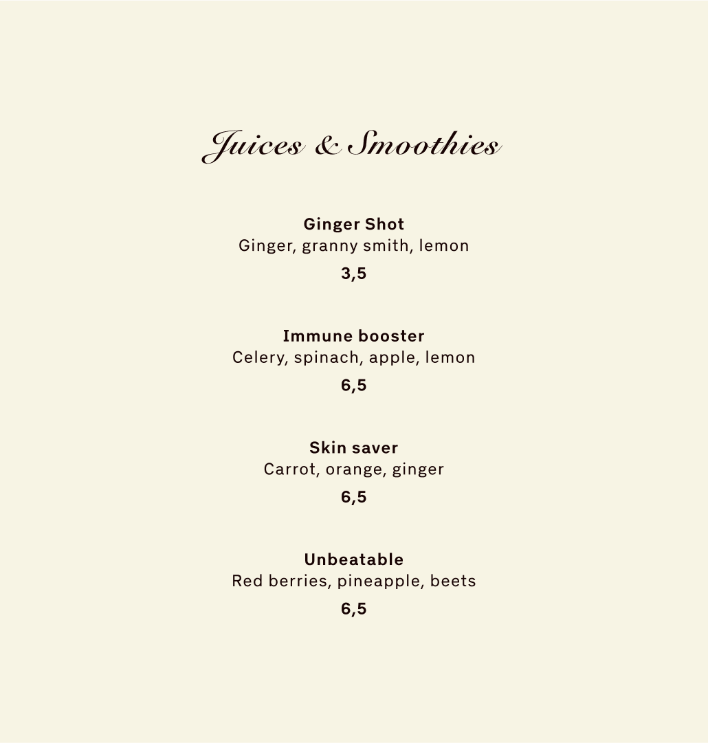
Typography became a key element of the brand’s personality. For one concept, we paired a sleek sans-serif with a warm script font, striking a balance between contemporary simplicity and approachable charm. In another concept, we explored a handwritten-inspired font, allowing flexibility for personal touches like handwritten coffee cup notes or casual labels, underscoring the brand’s human connection.
To add a playful, welcoming layer, we introduced light, scribble-style illustrations. These accents bring a handmade, friendly feel to the brand’s applications, from menus to packaging, reinforcing the idea of warmth and personal care.
The brand identity was built around the same ethos as the restaurant itself: thoughtful details that make every moment feel special. Whether through the casual elegance of the red palette or the fresh, natural vibe of the green concept, the branding is designed to adapt seamlessly to various touchpoints, from in-person dining to digital engagement.
At its core, Twenty Seven is more than a restaurant – it’s a space that celebrates the beauty of everyday moments. The branding reflects this by creating an experience that feels personal, approachable, and full of heart, inviting guests to slow down, savor the moment, and feel at home.
Here is what they said

