– Why We Don’t Rely on Words Alone
As a design and branding studio, we often hear clients describe their vision for a brand using adjectives like “bold,” “minimalistic,” “luxurious,” or “modern.” These words are great starting points, but we’ve learned that they can mean vastly different things to different people. One person’s idea of a “bold” brand might be neon colors and aggressive typography, while another person might imagine a simple, stark logo in black and white. The differences are huge, and that’s why we don’t rely on adjectives or text briefs alone when shaping a brand’s identity.
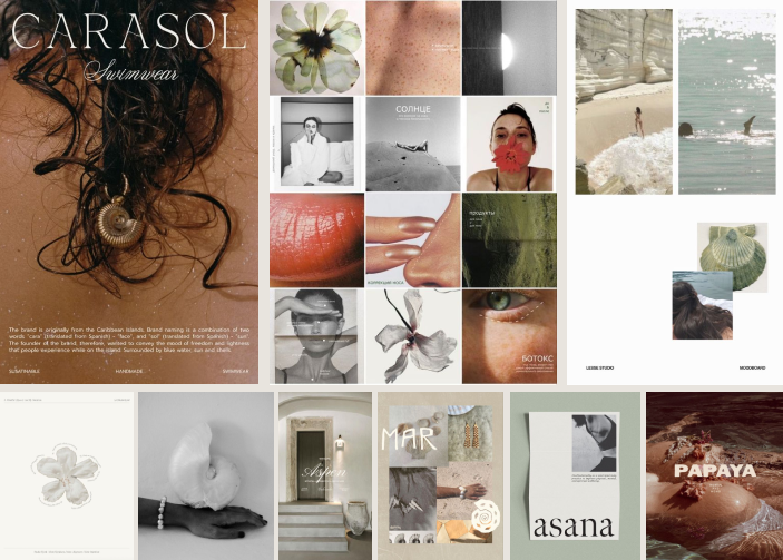
Let’s dig into why this happens and how we navigate these subjective waters by crafting moodboards and specific visual directions to ensure clarity and alignment with our clients.
The Subjectivity of Language in Design
Words are powerful, but they are also inherently ambiguous, especially when it comes to design and aesthetics. Every individual has unique experiences, cultural backgrounds, and visual preferences that shape their perception of adjectives. For example:
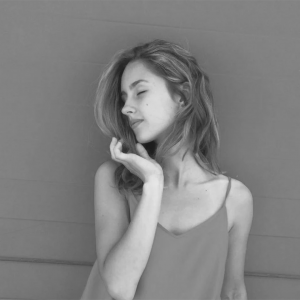
- Bold: To some, “bold” might evoke bright, eye-catching colors and oversized fonts. To others, it might mean something more understated but still powerful, like a minimalist, all-caps logotype in a single strong color.
- Minimalistic: While some may associate this with extreme simplicity—white space, clean lines, and the absence of color—others might see minimalism as a space where elegance and restraint meet, allowing for soft tones and organic shapes.
- Luxurious: For some, this may mean gold accents, rich textures, and opulence, but others may interpret luxury through more subtle cues: fine materials, soft tones, and thoughtful spacing.
These are just a few examples, but they illustrate the larger issue: relying on adjectives can lead to miscommunication and ultimately a brand that doesn’t align with the client’s true vision.
–
Why Moodboards Are Essential
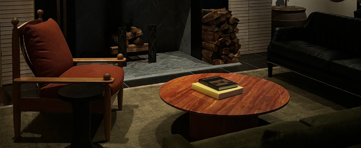
To overcome the subjective nature of language, we create specific moodboards for every project. A moodboard allows us to translate words into visuals, where we can clarify what terms like “bold” or “minimalistic” actually mean in the context of a brand’s design. Here’s why they’re so critical:
1. Visualizing the Concept
Moodboards help bridge the gap between vague adjectives and tangible designs. By gathering images, color palettes, typography samples, and textures, we create a visual representation of the brand’s future look. This helps to eliminate misunderstandings early on in the process.
2. Establishing a Shared Visual Language
By collaborating on a moodboard, we align our creative direction with the client’s expectations. Instead of relying on words, we have a set of visuals that speak to everyone on the project. The client can provide feedback on what resonates and what doesn’t, allowing us to course-correct and fine-tune before we dive into the actual design work.
3. Narrowing Down Subjectivity
By translating ambiguous adjectives into specific visual elements, we help narrow down the range of interpretation. For example, a client may want something “luxurious,” but by curating a moodboard, we can determine if they are drawn to opulent gold accents or if they prefer something more subtle and understated.
A Clearer Creative Process
In the world of branding and design, clarity is key. Every brand needs a clear visual direction, and relying solely on adjectives can lead to unnecessary revisions, misunderstandings, and delays. A moodboard, on the other hand, allows us to turn subjective descriptors into objective design elements.
This collaborative process also empowers our clients. Instead of feeling lost in the abstract, they have a clear sense of how their brand will come to life. They can see the interplay between colors, shapes, and textures, and offer meaningful feedback that drives the design forward.
Beyond the Brief: Visualizing Adjectives in Action
Our role as a design studio is not just to create, but to interpret. We listen to what our clients are saying, but more importantly, we translate their words into something they can see and feel. Adjectives will always be part of the conversation—they’re the starting point. But we believe in going beyond words and into the realm of visuals.
So the next time a client comes to us wanting a “bold” or “minimalistic” brand, we won’t just nod our heads and dive in based on our own interpretation. Instead, we’ll build a moodboard, define what these terms mean visually, and ensure that the brand we create truly reflects the client’s vision.
In design, visuals speak louder than words—and that’s why we let them do the talking.