Birl, previously operating behind the scenes to simplify the resale process for businesses, aimed to build a stronger brand identity to directly target customers and raise awareness. The goal was to rebrand Birl with a cooler, trendier image for the Scandinavian market while optimizing UX/UI to improve engagement and retention.
Our Solution
Phase 1: Branding We began by crafting a fresh visual identity for Birl, focusing on key elements:
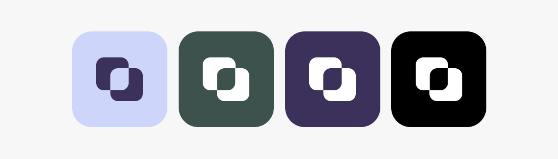
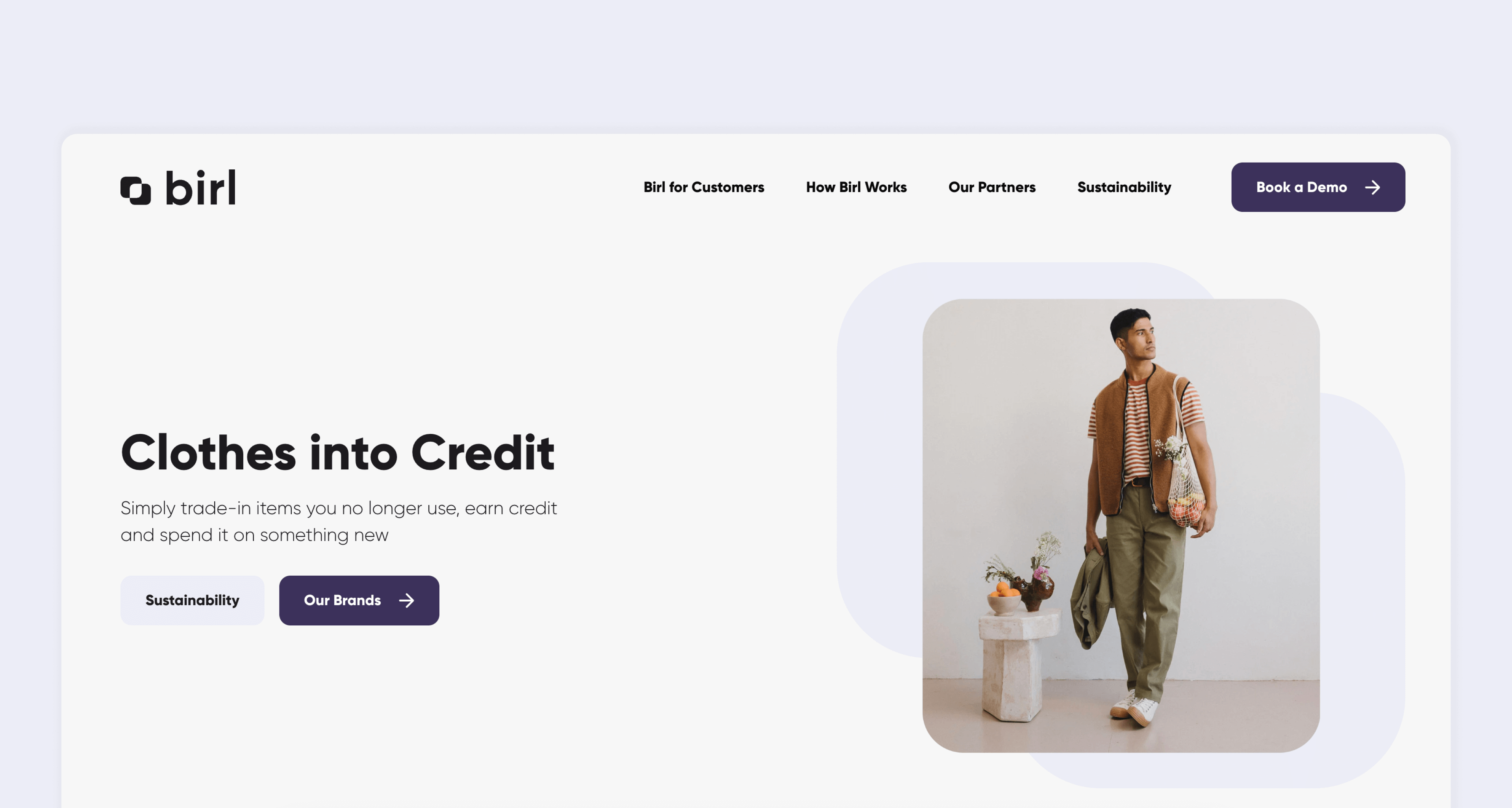
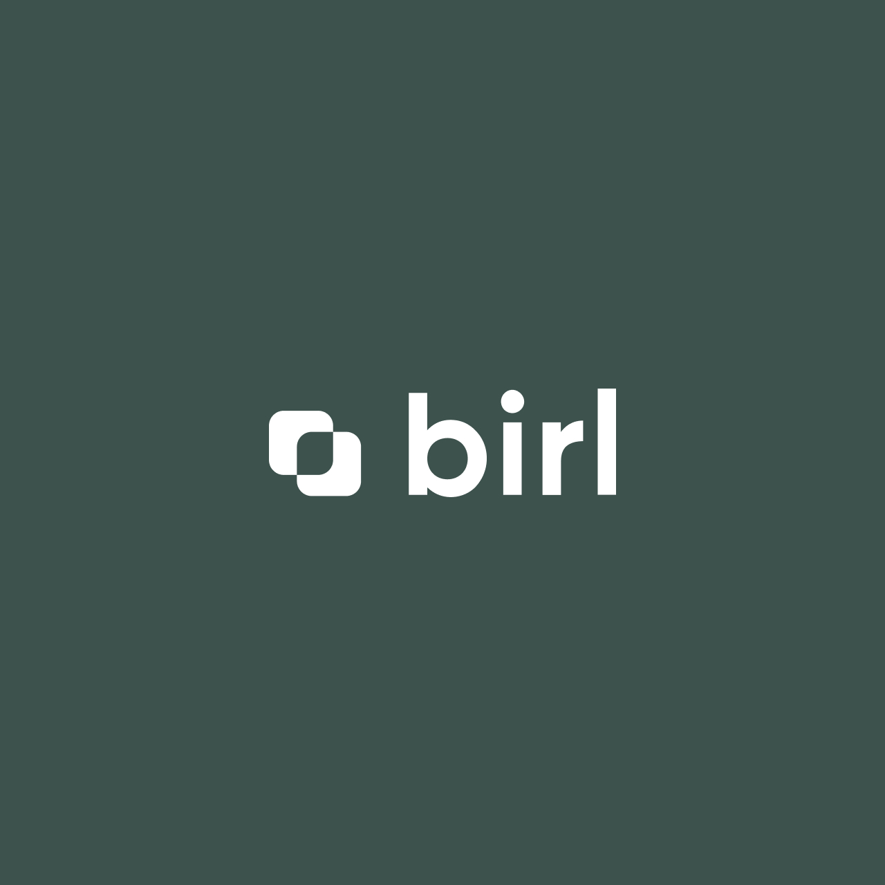
Logo Design: Created a distinctive logo featuring two overlapping rounded squares, forming abstract boomerangs. This symbolizes circularity and sustainability without relying on clichéd symbols.
Typography: Selected a soft, rounded typeface that strikes the right balance between modernity and approachability, perfectly complementing the logo.
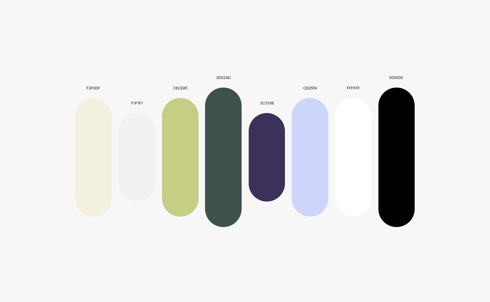
Color Palette: Chose soft earthy greens, purple, and lavender to convey calmness and sustainability, balanced by black and white to maintain a professional look.
Phase 2: Digital Presence and UX/UI Optimization With the brand identity in place, we turned our attention to optimizing Birl’s digital presence:
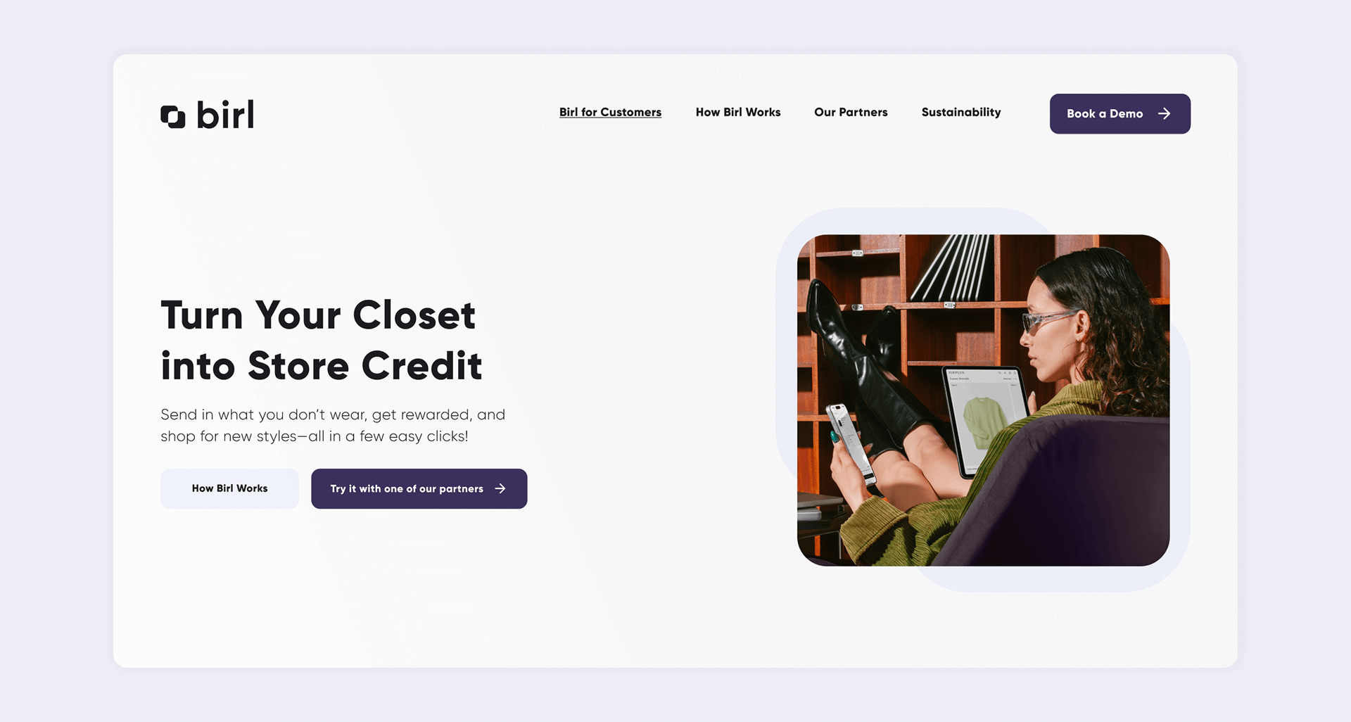
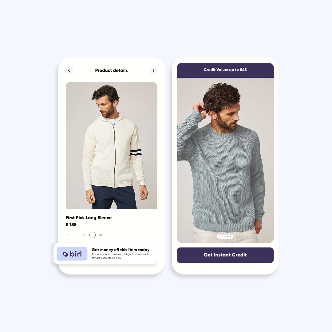
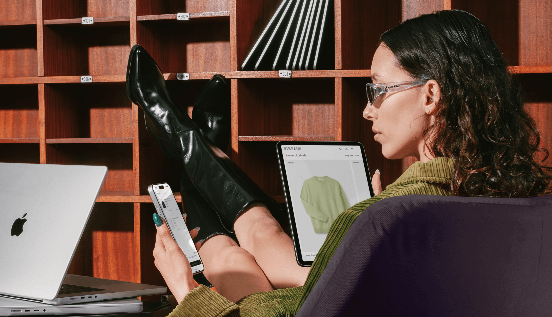
Website Redesign: Created a clean, engaging user experience with a strong focus on mobile optimization, ensuring a broader audience reach.
Social Media & Newsletters: Redesigned to deliver a cohesive and engaging brand experience across all digital touchpoints.
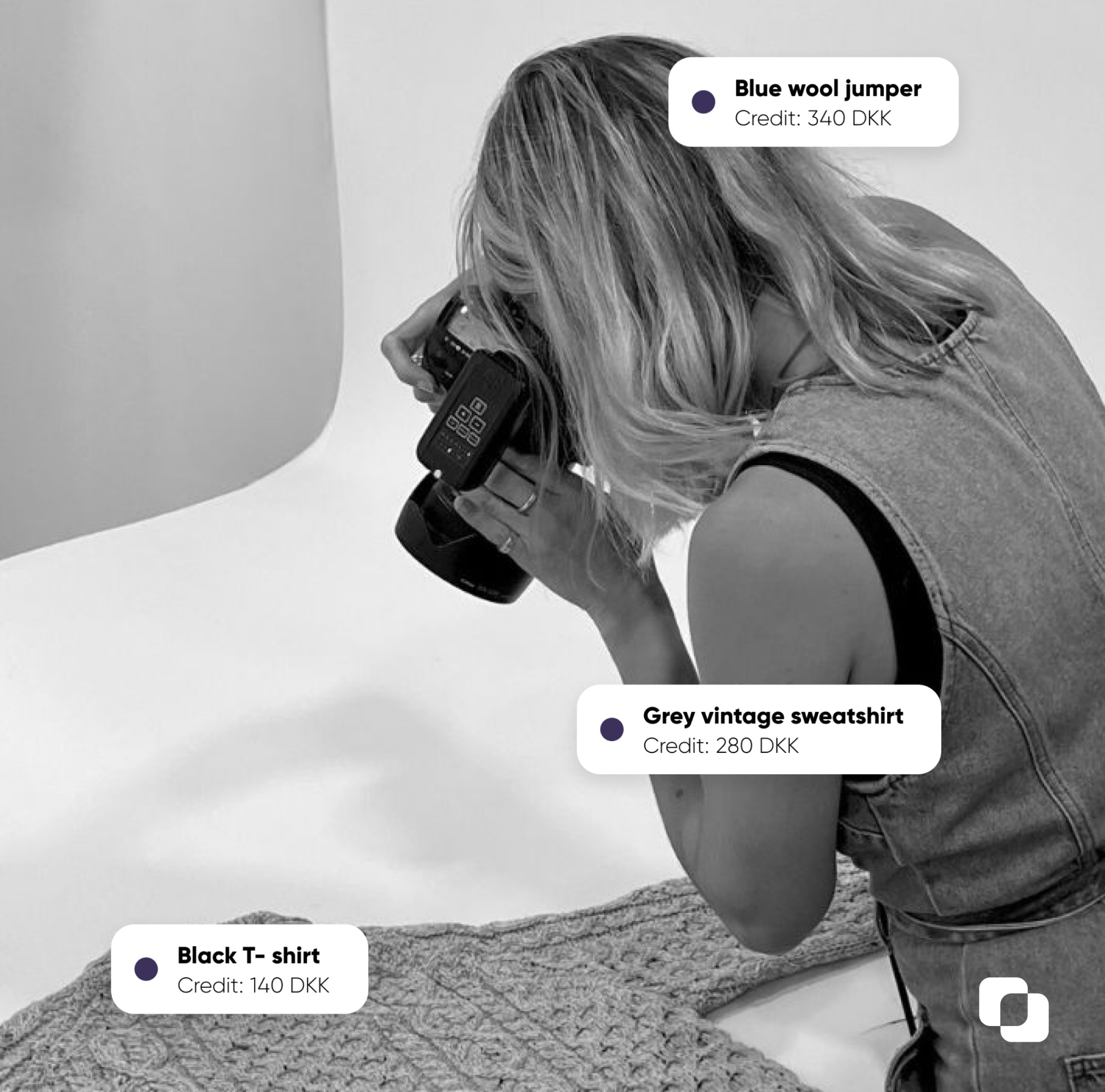
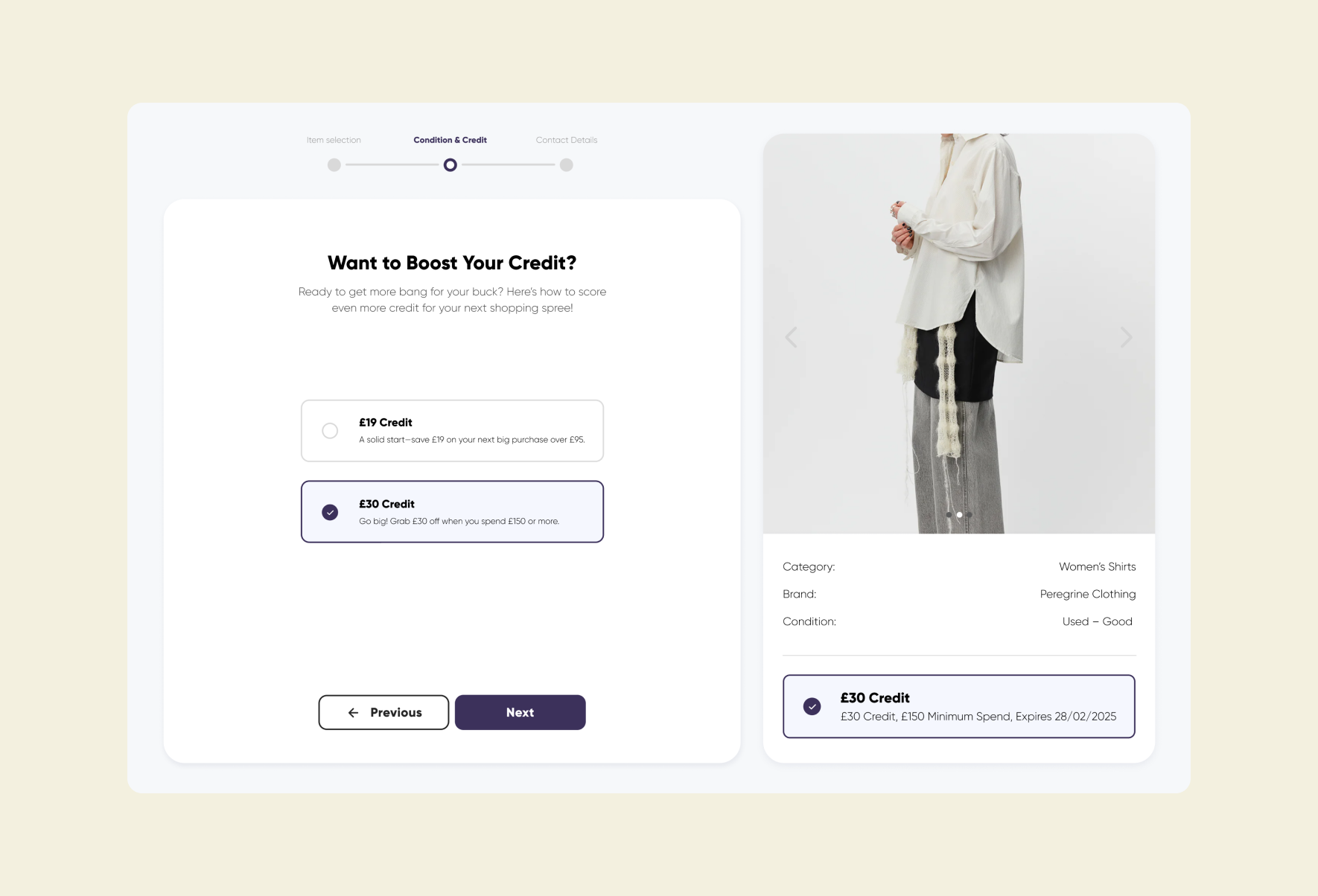
Third-Party Integration: Streamlined the trade-in flow on partner sites to provide a seamless, user-friendly experience, boosting conversion rates.
Outcome
This two-phase approach successfully repositioned Birl in the Scandinavian market, transforming them into a visible, customer-facing brand. By enhancing brand consistency, user experience, and sustainability, Birl strengthened connections with both businesses and consumers, staying true to its core mission of promoting circularity.
“Studio Blue was everything we had hoped to find when we set out to hire an agency for our re-brand: great creative ideas, brilliant communication, a quick turnaround, and fantastic value for money. We could not have asked for a better outcome. We will continue to work with Studio Blue moving forwards, and would definitely recommend working with them.”