Project Overview – Bra
Branding and Creative Direction
Bra Byrå – Good Agency
Studio Blue Agency
2024
Goals and objective
Bra Byrå, which translates to ‘Good Agency’ in English, is a Swedish charity communication agency. They are dedicated to providing high-quality communication services to their clients, free of charge. Instead of a conventional fee, Bra Byrå encourages clients to make a donation. With a commitment to social good over profit, all donations received by Bra Byrå are allocated to their associated organizations, which are actively engaged in the fight against bullying.
Our solution
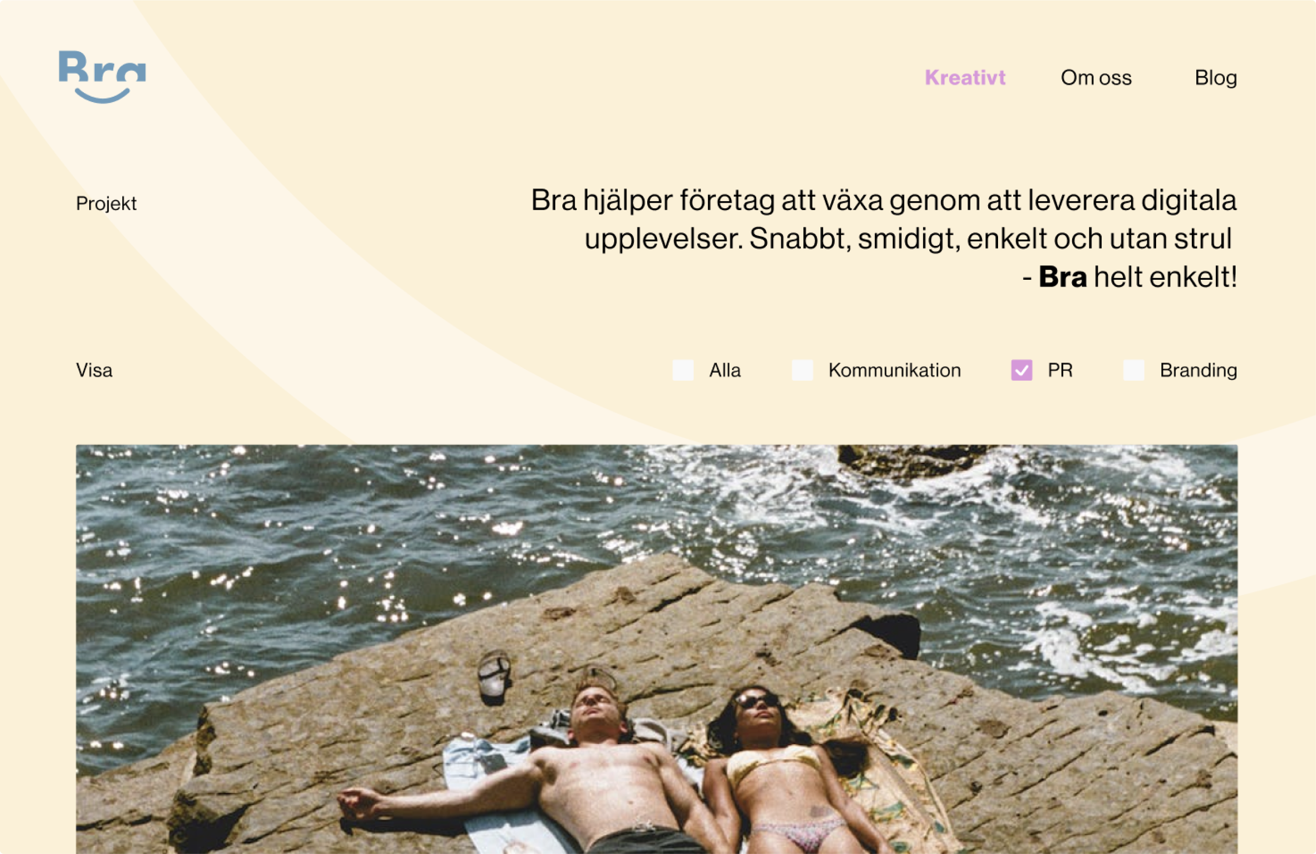
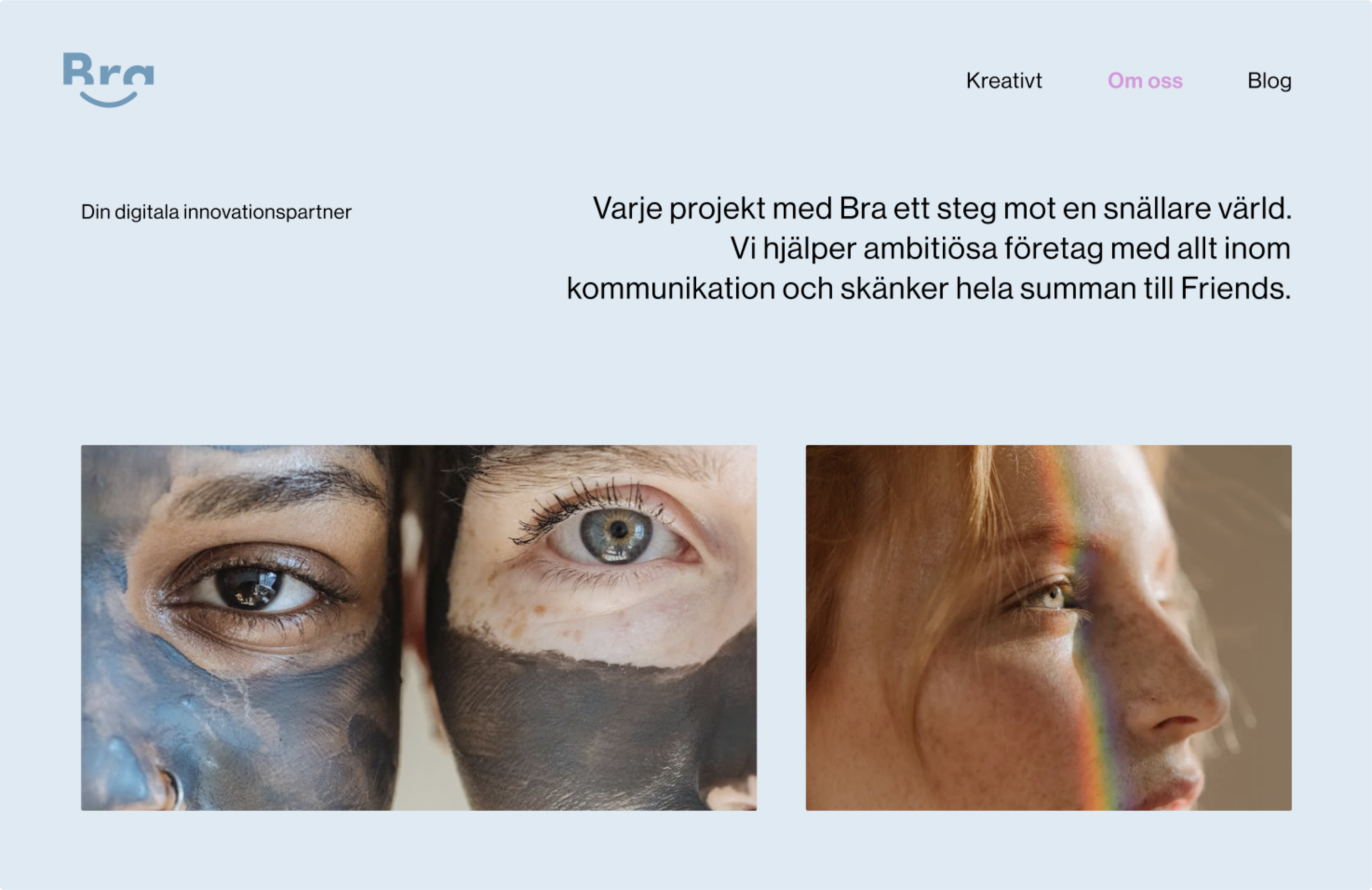
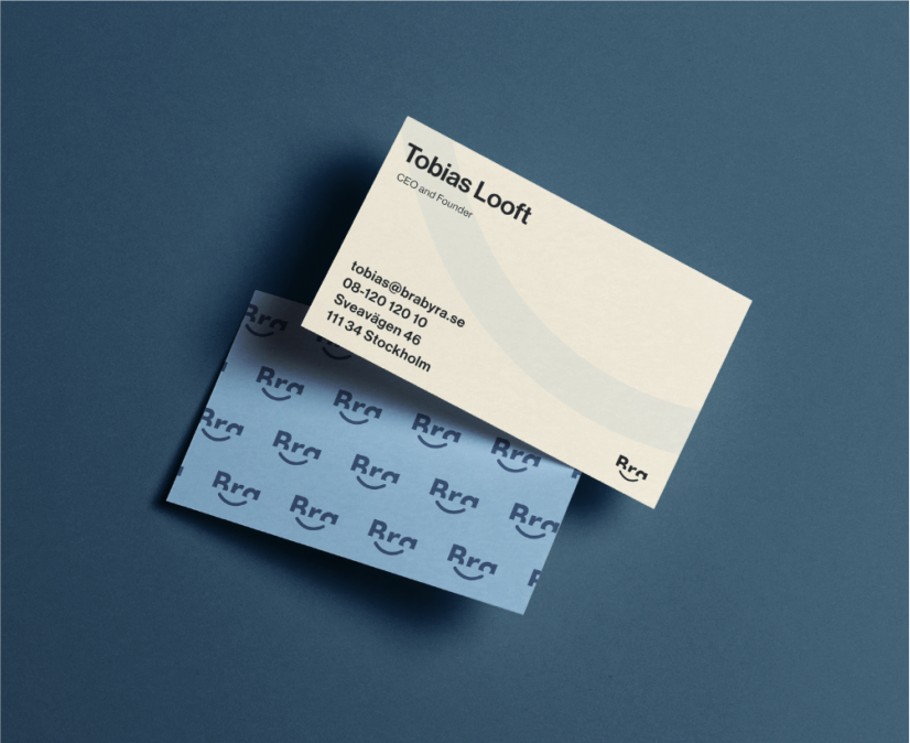
The selected colours, playful logo, funky urban photography and catchy, fun copywriting, is designed to capture the essence of Bra’s creative agency’s spirit.
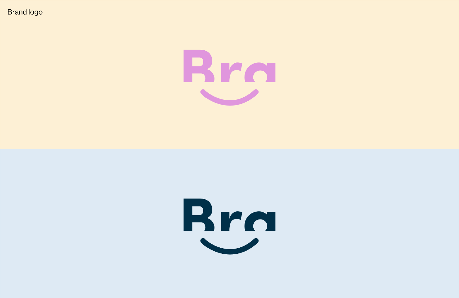
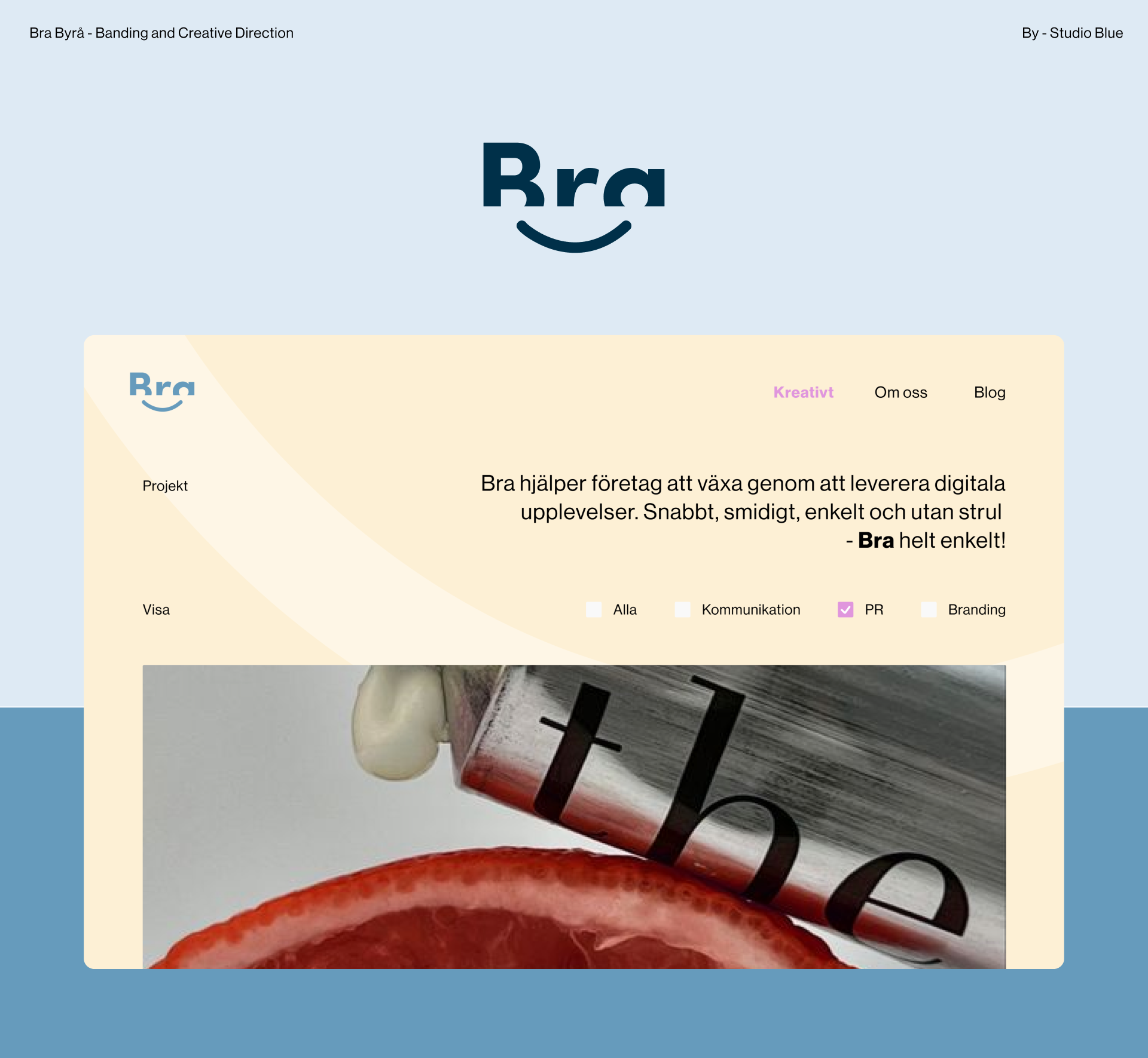
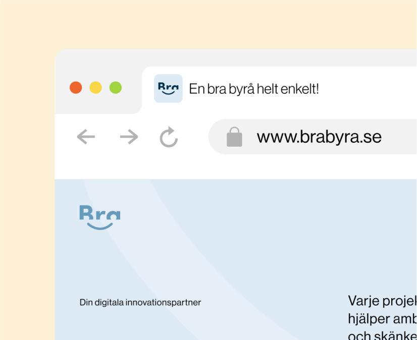
Bra’s logo is a creative take on the brand name, shown in an abstract style. Its design smartly cuts off the bottom of the text but keeps ‘Bra’ clear and legible. The font is playful with rounded characters.
A unique part of the logo is the smiley face line under the text. This adds to the logo’s friendly vibe, reflecting the agency’s focus on positive and approachable interactions. The logo aims to create a lasting, emotional link with their audience, capturing Bra’s positive brand spirit.
The logo is memorable, bold, eyecatching and durable, works in all formats, sizes and colours.
The color palette is curated to blend reliability with creativity, using blues to provide a professional foundation, while pink adds a playful charm. The creamy off-white serves as a balancing element, ensuring the brand feels approachable and soothing.
The overall design will reflect a contemporary, dynamic character, appealing to an audience that values creativity and innovation. These colours are easy to combine and work with.

Here is what they said

